In the last of our brand refresh series, we are looking at the meaning behind the new logo mark. As you may have noticed, it is based on an asterisk.
“Asterisk: Of Latin origins, meaning “Little Star.”
A typographical symbol used to indicate that there is more than initially observable, subject requires additional research or context to be truly and fully understood. More to discover.”
The symbolism is simple yet elegant. The new logo mark helps to drive home the idea that there is more to the queer community than initially meets the eye. The community is so diverse and wonderful that the only way to truly know it is to be involved and educated. There is always something new to learn and always room to grow. The Latin origin of the name make it doubly fitting. “Little star.” This is exactly what each young person is, a star – unique and beautiful in away only they can be. And when they shine together, it is awe-inspiring.
This logo is an affirmation of our pledge to support the whole person in every individual who comes to IYG.
The shape and colors represent our adaptability and commitment to remain relevant and responsive to the needs of the young people we serve at all current and future locations.
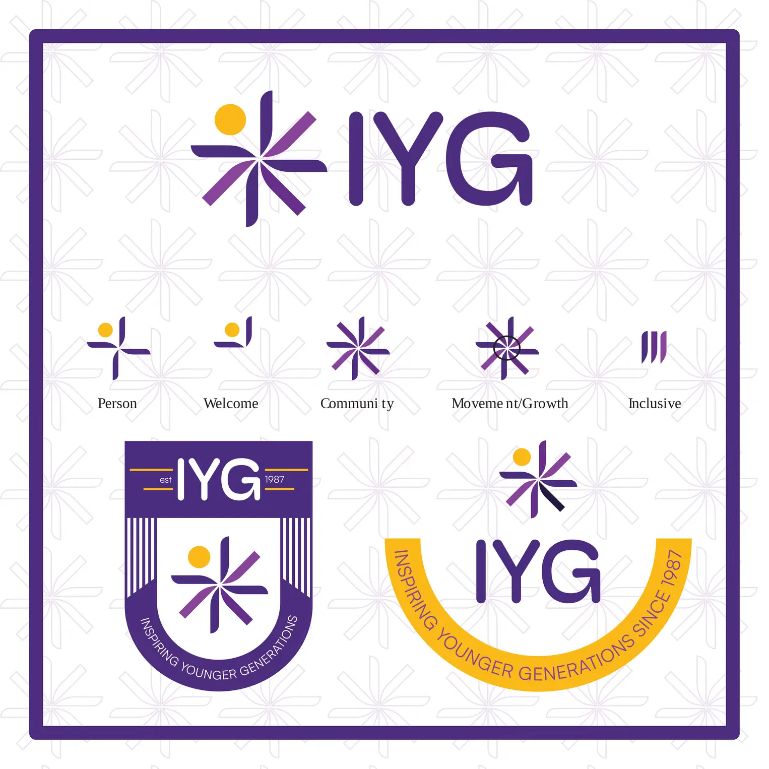
Notice what makes the logo uniform but also different. Purple represents the community of queer young people, but there is not just one shade. The spokes are different shades, shapes, and sizes. This represents that while they are all part of one large community or family, everyone is still unique, diverse, and different – something to be celebrated together.
Take a look at the graphic to see some of the other meanings drawn from the logo: Person, welcome, community, movement/growth, inclusivity.
You may also notice two key variants of the logo that will be used regularly. The shield-shaped logo to the left will appear on staff apparel and materials. This logo represents our staff’s pledge to take up the shield of IYG and defend queer young people, their lives, their rights, their dignity. This is part of how we inspire younger generations and foster them to become the next generation of empowered queer leaders.
The logo to the right is one that will be sported by our volunteers, interns, and board members. In a previous post, we discussed gold representing the community that support queer young people. The golden arc around this logo symbolizes how our community embraces and supports those we serve.
We know that change is difficult, and we hope that, after learning more about the thought and meaning behind the new look, you all will come to love it as much as we do. We appreciate the feedback and discussion regarding the change. We also so greatly appreciate each and every one of you who have reiterated your commitment to supporting us in our mission of empowering LGBTQ+ young people and creating safer space for them. No matter what our logo looks like, no matter what colors we use, our number one priority above all else is to support our youth and young adults and magnify their voices.
We are carrying on the legacy of our founders, Chris Gonzalez and Jeff Werner.
Just as IYG has done since 1987, we are inspiring younger generations.
We are IYG. Then. Now. Forever.
